Our Approach
At Pixeel D Square, we understand that a brand's identity is pivotal in establishing its presence in the market. For the "Bridge App" project, our mission was to craft a visual identity that reflects the app's purpose—bridging gaps and connecting people. We embarked on a journey to design a logo and branding that resonate with the app's core values of connection, accessibility, and simplicity.
Vision and Innovation
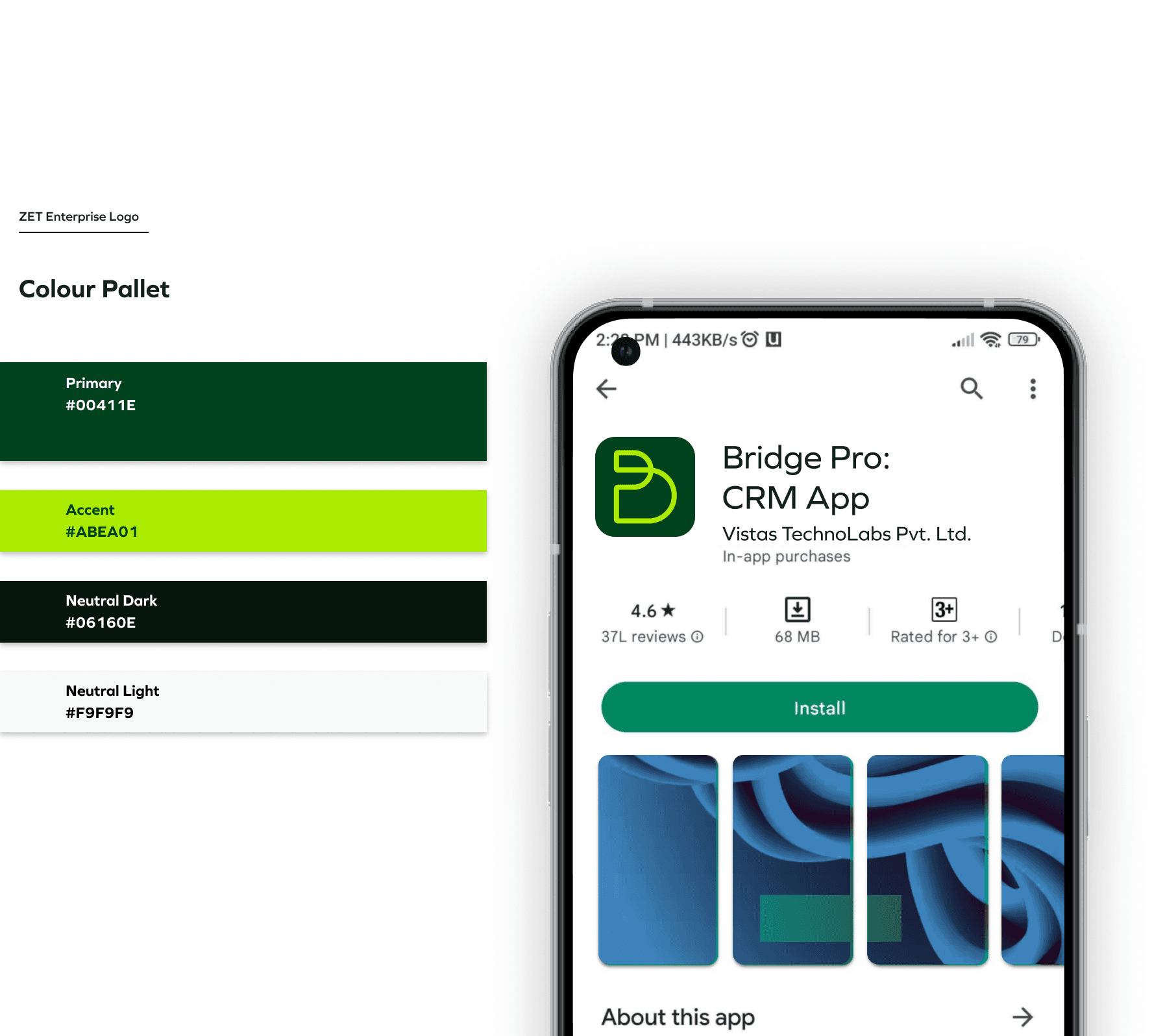
The vision behind the Bridge App’s identity was to create a logo that is not only modern and sleek but also versatile enough to be used across multiple platforms. Our team focused on developing an identity that is both memorable and scalable, ensuring it maintains its visual impact regardless of where it is applied. By using clean lines, vibrant colors, and an adaptable design, we aimed to create a brand identity that stands out in the digital landscape.
Identifying Unique Challenges
The challenge was to design a logo that could communicate the essence of "bridging" in a simple yet powerful way. We needed to encapsulate the idea of connection and accessibility while ensuring the design was versatile enough for various digital environments. Our approach involved extensive research and brainstorming, which led to the creation of multiple logo options that were refined through user feedback and client collaboration.
Resolving Complex Problems
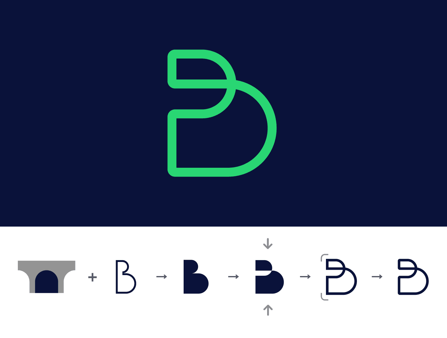
Our solution to the design challenge was to focus on the symbolic representation of a bridge, utilizing abstract forms and minimalist design elements. The final logo design is a fusion of simplicity and meaning, combining the letters "B" and "D" to form a bridge-like structure. This design not only represents the app’s purpose but also ensures easy recognition and recall, essential for a strong brand identity.
User-Centric Design
In line with our user-centric philosophy, the branding was designed with the end-users in mind. The logo and brand elements were created to be easily recognizable, ensuring that users can quickly identify the app in a crowded marketplace. We also focused on creating a color palette that is visually appealing and conveys the brand's values, further enhancing the user experience.