Design Approach:
The design process began with a deep dive into MARG's mission and objectives. We aimed to create a logo and visual identity that would encapsulate the complexities of memory and anxiety research in a clear and engaging way. The design had to be versatile for use across various platforms, including research publications, digital media, and stationery.
Logo Design:
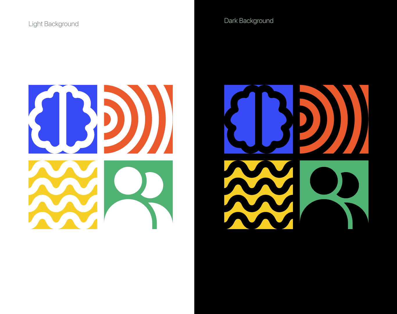
Concept: The logo was designed using a combination of abstract shapes and symbols that represent key aspects of memory and anxiety. Each element within the logo—waves, circles, and lines—symbolizes different facets of cognitive processes, with a cohesive arrangement reflecting the group's holistic research approach.
Color Palette: A vibrant color scheme was selected to convey energy and curiosity while maintaining a sense of professionalism. The palette includes shades of blue, orange, green, and red, representing various dimensions of memory and emotion.
Typography: A clean and modern sans-serif typeface was chosen for the MARG wordmark, ensuring readability and a contemporary look. The typography complements the abstract nature of the logo, adding to the identity’s clarity and impact.
Branding Elements:
Logo Variations: Multiple logo versions were created for different backgrounds (color and monochrome versions) to ensure adaptability across various media.
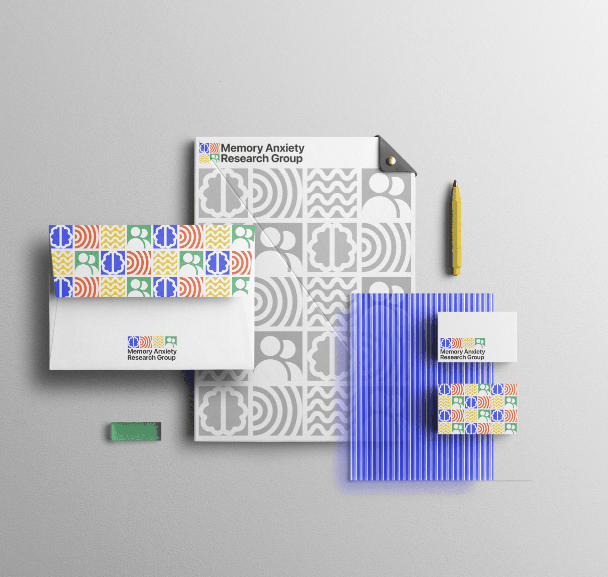
Stationery Design: Custom stationery, including business cards, letterheads, and envelopes, was designed to create a cohesive visual identity for MARG. The branding elements were applied subtly to convey professionalism while maintaining visual interest.
Digital Presence: Social media and digital templates were designed to reinforce MARG's brand identity online, ensuring consistency in communication.
Brand Guidelines: A comprehensive set of brand guidelines was developed to guide the use of logo variations, color palette, typography, and other branding elements, maintaining uniformity across all touchpoints.